10 Best Subtitle Fonts for Video in 2025
98% accurate, real-time transcription in just a few clicks. 58 languages and multiple platforms supported.
Adding closed captions and subtitles to your videos can help with SEO and makes your video content much more accessible to anyone hard of hearing or unfamiliar with the language. Subtitles can help viewers understand the video without turning on the audio, and they can increase your engagement. Studies have even shown that 85% of Facebook videos are watched without the sound turned on, so you don’t want to miss out on the many benefits of adding subtitles and closed captions to your video.
Today, we’re sharing the 10 best fonts for subtitles and closed captions on videos so that you can benefit your audience, increase accessibility, and improve the SEO of your videos.
What to consider when choosing subtitle font for videos
When choosing a font for subtitles or closed captions, it can be challenging to decide which one to choose because of the significant number of fonts available. Not only does your video editing software likely have hundreds of pre-installed fonts, but you can easily download more fonts online, many of which are free or sold at a low cost.
So, how do you know which fonts are best for your subtitles? Use the following guidelines to choose the best subtitle and closed caption font for your videos:
Choose a font that is not distracting. You don’t want your font choice to take away from the video and visuals on screen.
Avoid fonts that are highly stylized and hard to read. People only have a few seconds to read subtitles, so the font needs to be clear and easy to read. Cursive or artsy fonts are too challenging to read in a short time.
Select a font size that is large enough to read quickly but not overwhelmingly big against your video frame. The text also needs to be big enough and spaced apart enough so that bold or italic text won’t run into each other.
Choose a font that fits your brand's style or the video's theme. For example, a traditional sans serif font would be an excellent choice for an educational, informational video.
Check with the video guidelines on the platform you’re posting your video. Some social media platforms only accept specific fonts, so make sure you check with the guidelines before you waste your time adding subtitles in a font that isn’t accepted.
Consider if you want to use a drop-shadow or outline to enhance the font’s visibility on video. Adding a drop shadow or outline can improve the look of a font that is hard to read, but you should ultimately choose an easy-to-read font and not rely heavily on added effects.
Best practices for formating subtitle fonts on videos
Formatting your subtitle fonts is an essential step in making your subtitles and closed captions readable and practical. Take the following steps to ensure your subtitles are improving the accessibility of your video content:
Choose font colors that create a strong contrast. For example, make your font white against a dark background or dark gray against a light video background.
Don’t choose a font color that is hard to read or distracting, such as pastel or neon colors.
Replay your video with subtitles to ensure that they are readable throughout the entire video, even as the background colors shift. Depending on your video, you may need to change caption font colors at different times or give your subtitles a background.
Keep your caption font the same throughout the whole video for continuity.
Keep your text aligned to the left for better readability.
Consider a background color blocked out against your text to increase readability.
Notta can convert your spoken interviews and conversations into text with 98.86% accuracy in minutes. Focus on conversations, not manual note-taking.
10 best subtitle fonts for videos
Fonts are a personal choice for your video branding. However, certain font choices are more popular than others because of their legibility.
Here are our top recommendations for the 10 best subtitle fonts for videos in 2022, including a breakdown of where you can find them, cost, what they are best for, and a sample image showcasing the font.
1. Arial
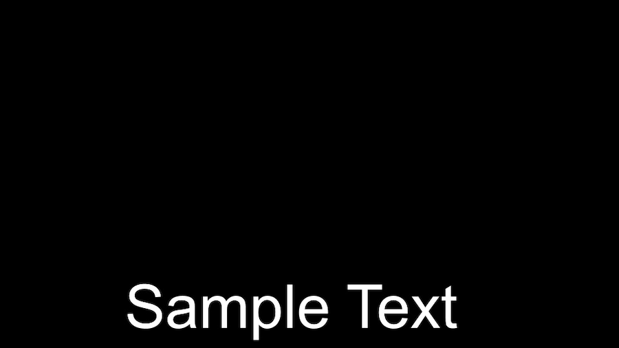
Arial is a great sans-serif font that is a safe, popular choice if you are unsure what font to choose. This simple font is an easy-to-read choice. If you’re looking for a bolder option, consider Arial Black, which is a striking option. However, remember that Arial Bold can become very bulky if you create captions with long sentences. As with any of these fonts, try them out for a few scenes before you create captions for the entire video.
Price: Free for personal use, commercial cost varies
Where to find: Already pre-installed with most programs. Download here.
Best for: Universal sans serif font option
2. Lucida Grande

Lucida Grande is a humanist sans-serif typeface that is ideal for a variety of projects. It’s a standard font included in Adobe Premiere Pro CC, making it an excellent choice for editors using Adobe Premiere Pro. It’s clear, simple, and easy to read, making it a versatile choice.
Price: Free for personal use, commercial cost varies
Where to find: Fonts family
Best for: Adobe Premiere Pro users
3. Futura
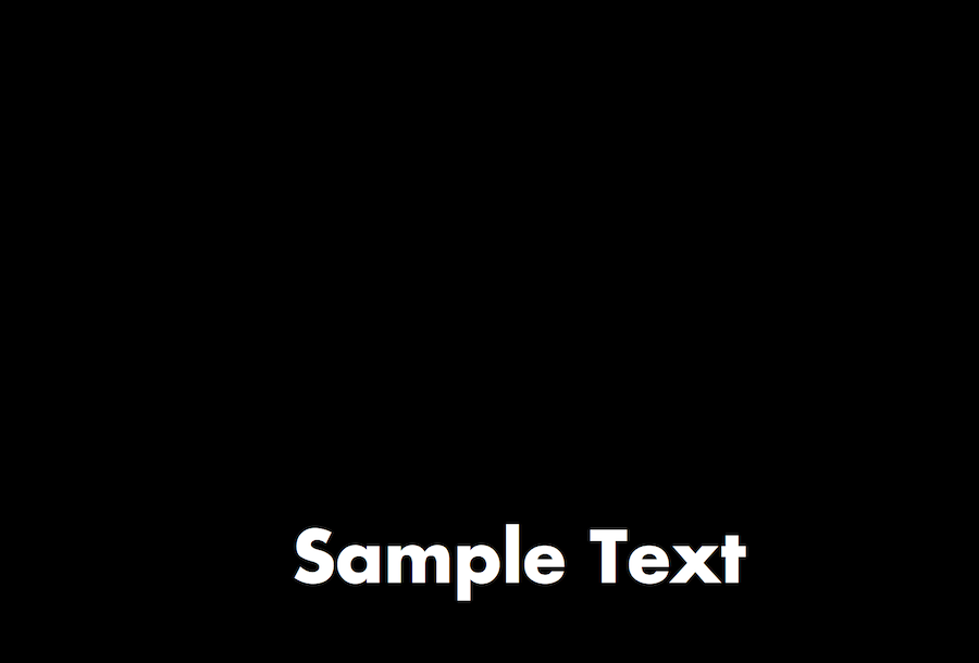
Futura is a great sans serif font that is clear, easy to read, and fits a variety of contexts. It’s terrific for movie subtitles, work presentation captions, and social media content. We recommend it for users who need to fit long sentences and a lot of text on screen. In addition, Future comes in over 20 different designs, including a bold version, which is showcased above. We love the impactful look of Bold Futura for titles.
Price: Free for personal use, needs to be purchased for commercial design
Where to find: Fonts family
Best for: Users who need to fit a lot of text on their screen
4. Tahoma
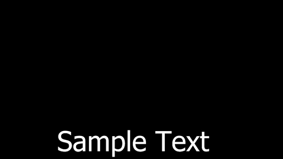
Tahoma is a Microsoft distributed humanist sans-serif typeface that is standard on many video editing programs. It’s one of the few fonts that are widely available as Arial, and it’s often the default on Windows programs.
Tahoma is similar to Verdana and may be a good choice for fans of Verdnaa looking for a narrower, tighter font option. In addition, Tahoma comes in a variety of versions, including italic and small caps types.
Price: Free for personal use, commercial license needed
Where to find: Dafont
Best for: Editors looking for a narrow, sleek font option
5. Impact
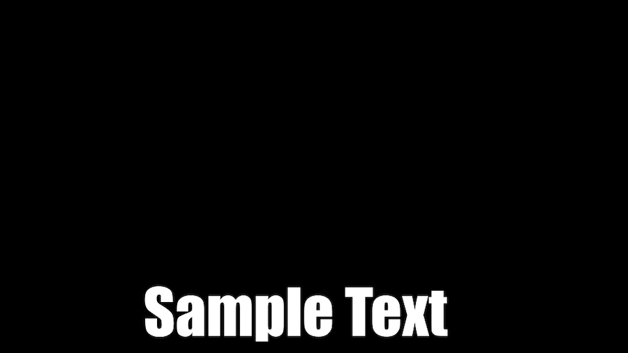
Looking for an impactful font for an action-packed, quick video? The Impact font is a strong choice that makes a statement. This realist sans-serif typeface is a core font on Windows computers and is frequently used in Internet memes, image macros, and titling. We like this font’s industrial, bold look. However, it doesn’t offer an italic or bold weight option, so it’s best suited for subtitles, which don’t typically use italics to emphasize sound effects.
While we don’t recommend this for long-form content, it can be an excellent option for punchy social media and stylistic content.
Price: Free for personal use, commercial cost varies
Where to find: Dafont
Best for: Stylistic, short-form video content
6. Georgia
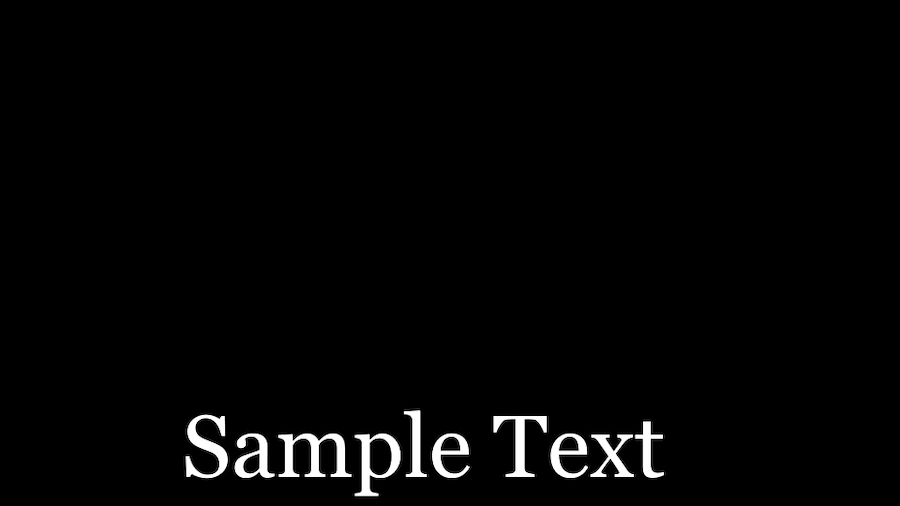
Georgia is an ideal font for small-size text reading. Its serif typeface makes it elegant, flawless, and highly legible. While it was originally designed for printing, it makes an excellent choice for subtitles and closed captions, especially for video content primarily watched on small screens, like mobile devices.
If you enjoy Times New Roman or Futurama, Georgia is an excellent choice to add to your font arsenal.
Price: Free for personal use, commercial cost varies
Where to find: Fonts family
Best for: Videos watched on small or low-resolution screens
7. Verdana

Verdana is a popular, modern font choice with a futuristic look, making it great for innovative, technology-centric projects. However, it’ll look amazing in nearly any context because of its clean, sturdy build. It’s a good choice for projects that require a lot of text on the screen at once because it is tightly constructed and won’t take up too much space.
Price: Free for personal use, commercial cost varies
Where to find: Fonts family
Best for: Videos with modern branding
8. Times
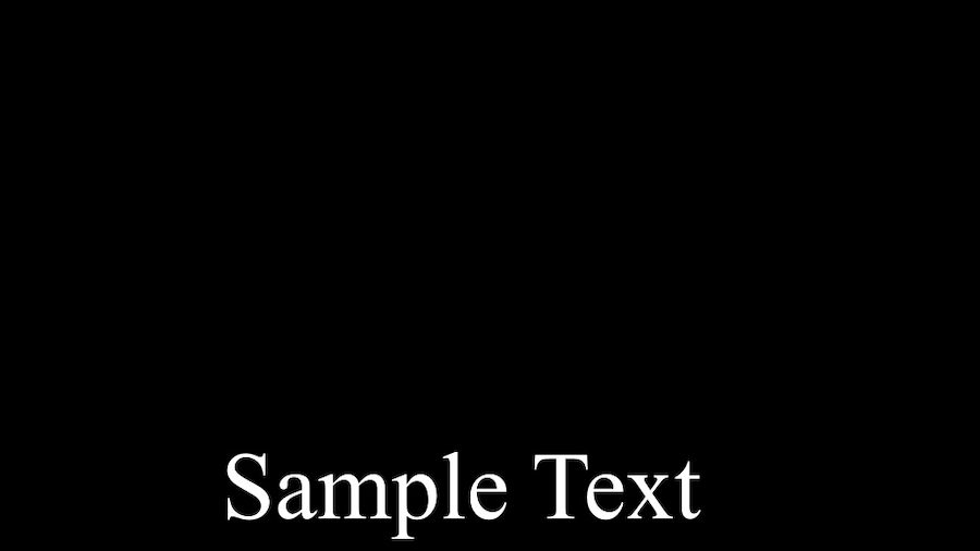
Times is an old-style serif typeface that has been paramount to design for decades. It is one of the most widely installed typefaces of all time and is frequently used in magazines and newspapers. We like the tall x-height of this font, which gives it a classic, elegant look.
Times is a comfortable choice for any project because it is so familiar to viewers. However, if you’re looking to make a statement, this may not be the choice for you. On the other hand, if you’re looking for a non-distracting font that blends in, this is the perfect, sophisticated choice.
Price: Free for personal use, commercial cost varies
Where to find: Fonts family
Best for: A non-distracting reading experience
9. Helvetica Neue
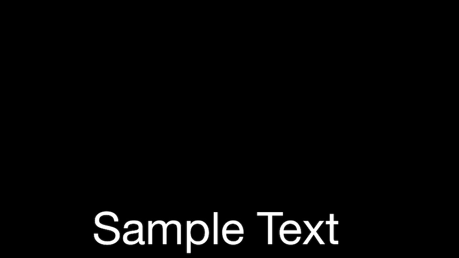
Helvetica Neue is a sans serif font that evolved out of the famous Helvetica font family. The newer Helvetica Neue font was edited for better readability, including changes to increase spacing, improve punctuation legibility, and add more number options.
We like the many options that Helvetica Neue has to offer, especially for Adobe Premier Pro users who have over ten varieties of this font to choose from.
Price: Free for personal use, commercial cost varies
Where to find: Fonts family
Best for: Adobe Premiere Pro users looking for a wide range of font styles
10. STIXGeneral
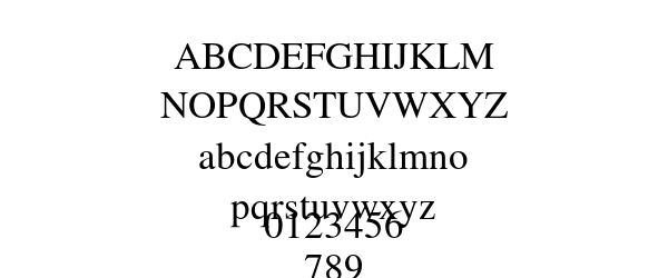
Source: EverythingFonts
STIXGeneral has a stylistic, fancy feel, making it an excellent choice for video essays, journalism projects, and documentaries. This formal serif font option is classy, elegant, and a perfect choice for eye-catching titles or white text preambles.
We recommend this font for stylish, educational videos. However, it’s not ideal for projects with a lot of text or light backgrounds as it can be harder to read compared to some of the other font choices on this list.
Price: Free for personal use, cannot be used for commercial purposes
Where to find: MF
Best for: Educational, stylish content
Use Notta's AI transcription tool to quickly and easily transcribe audio and videos. We guarantee accuracy and ease of use.
FAQs
What is the best font size for subtitles and closed captions?
The best font size for subtitles and closed captions is easy to read but not big enough to be distracting from the video content. You’ll want to consider the font needs of people with poor eyesight so that they can still read the subtitles and closed captions easily. We recommend starting with a 22 pt. font for subtitles and closed captions. Experiment from there until you find the right size for your project.
How should I format my subtitles and closed captions?
You should format subtitles and closed captions to make them as legible and accessible as possible. We recommend aligning your text to the left, making your font large enough to read quickly, and using the same font throughout your entire video. Choose a font color that contrasts with the video to increase readability.
What font do YouTubers use for subtitles?
The font YouTubers use for subtitles varies based on the YouTuber and the type of content they make. The majority of YouTubers use Roboto Medium because it is the default font choice for subtitles on the YouTube platform. However, you can customize your font option within the subtitle editor.
What color is best for subtitles?
The color that is best for subtitles is easy to read and stark against the video background. We recommend choosing white text in a legible sans-serif font or a sans-serif font for a more modern look that isn’t too overpowering on screen. Opt for a thin, dark outline in blue or black to increase your subtitles’ readability and contrast against your video background.
Should subtitles have a background?
Subtitles can have a background, especially if your video has light and dark backgrounds. A background may be the only way to ensure that your text is legible throughout the entire video. Having subtitles with a background is preferable to changing the font color halfway through your video, which most viewers will find massively distracting. However, if possible, we recommend skipping the background and choosing to outline your subtitle text in a dark color to increase contrast against the video background.
Closing thoughts
Choosing a font style may seem like a minor decision, but it makes a large impact on the feel and style of your video. Take your time choosing a font that is legible, easy on the eyes, and fitting for your audience and video’s message to make a statement. Don’t forget to pay special attention to your subtitle font’s color, size, and positioning. All of these factors can potentially make or break the legibility of your video text for viewers.